Devlog #4 - Game Art and Testing Session
DEVLOG #4: Game Art and Testing Session
Ladies and Gentlemen, Welcome to Week 4. With the testing session rapidly approaching, this week's efforts mostly concerned making the game look pretty. Let's get stuck in.
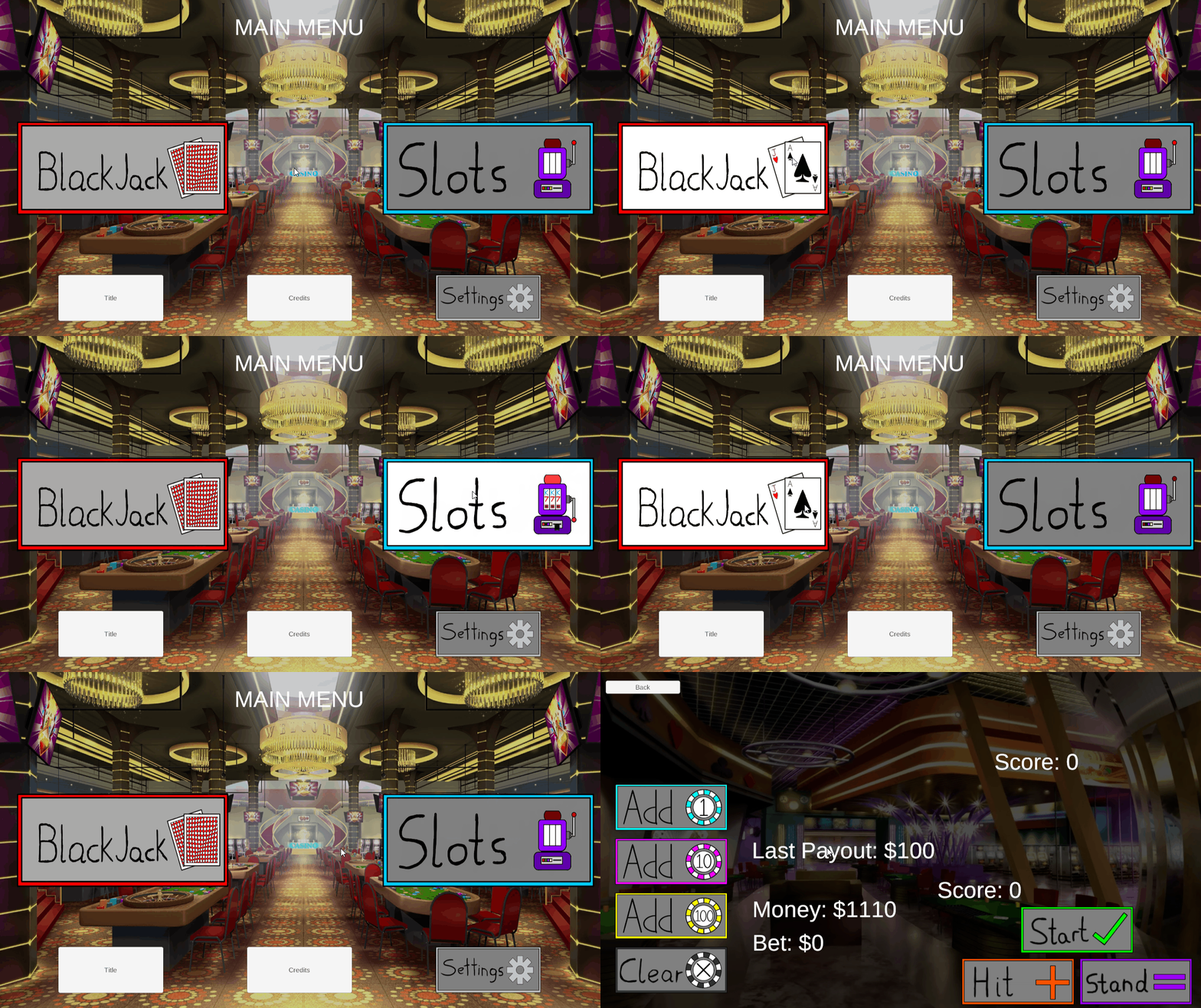
The first order of business: Buttons. Fancy light-up buttons. To that end, most of the buttons in menus and gamemode now have custom art and light-up when hovered over!

They even have little animations in them, which is pretty neat.
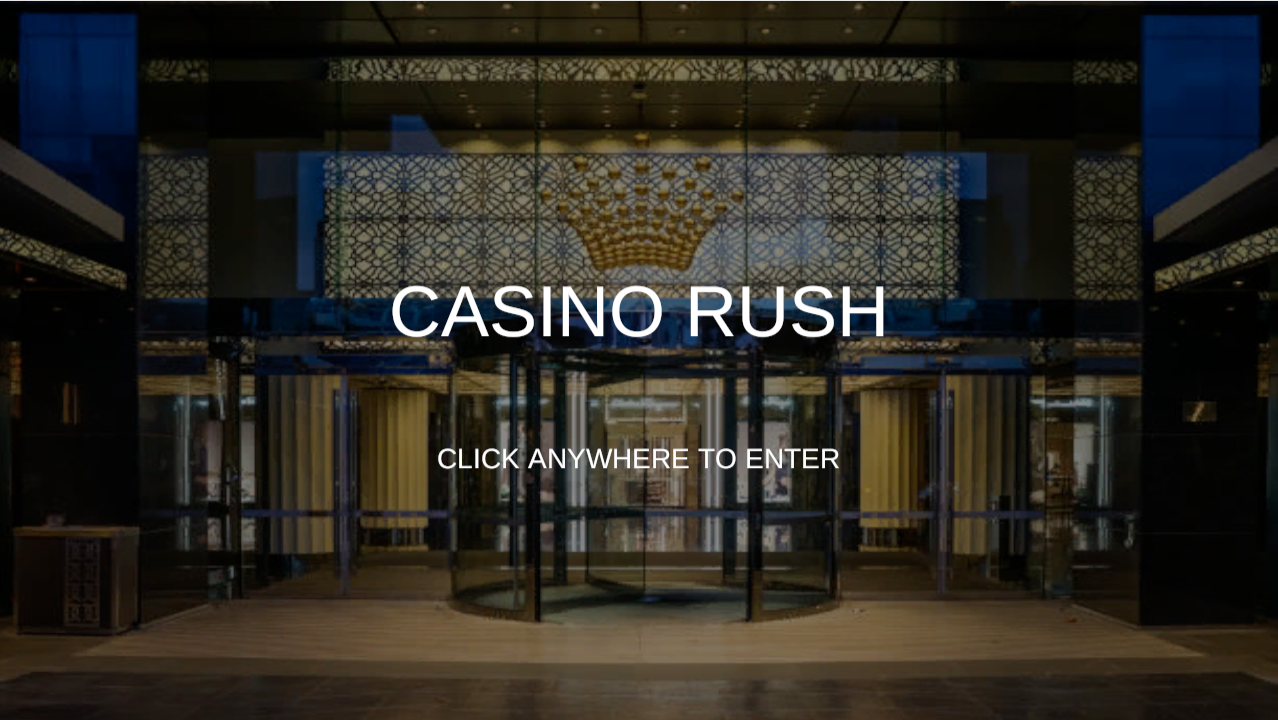
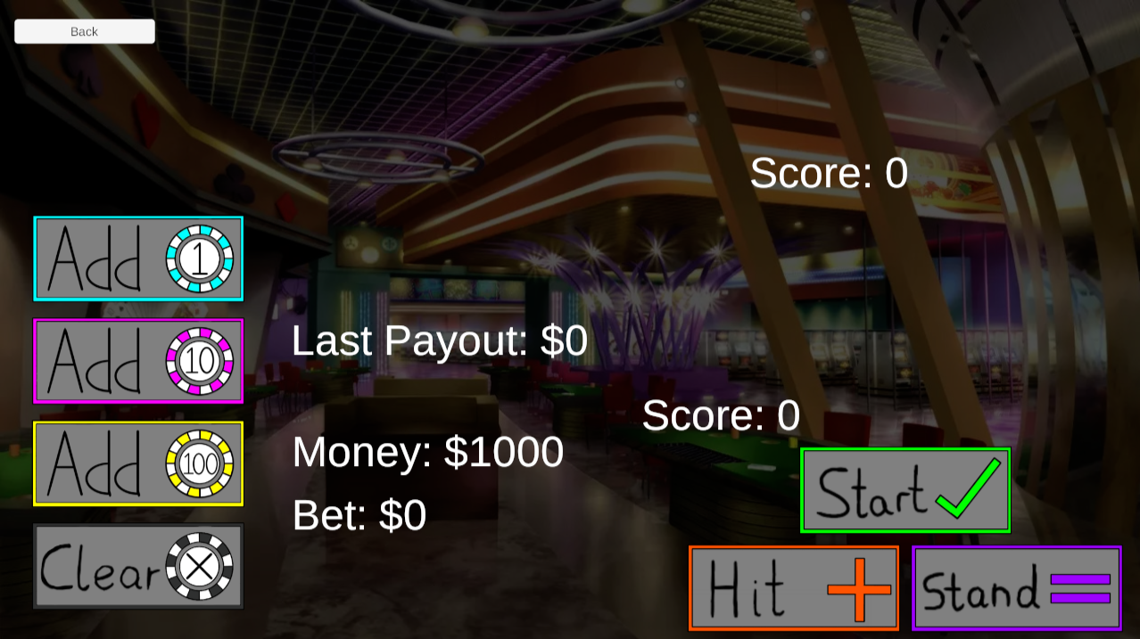
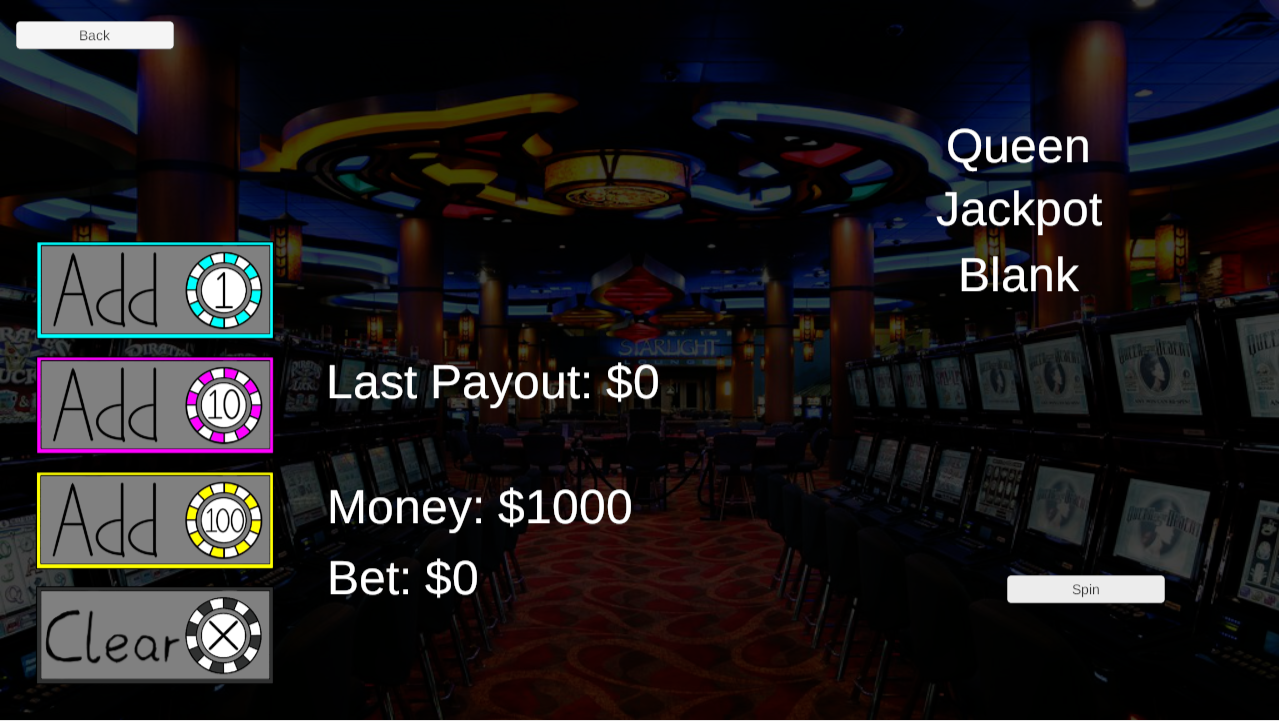
Next up, as I'm sure you've noticed, is that most of the pages now have fancy backgrounds! Here's some previews of these:
Title Screen:

Blackjack:

Slots:

Last on the agenda, as I mentioned at the top of this post, is the upcoming testing session and survey. This is an opportunity for me to get feedback on what's working well, as well as what needs improvement. A link to the survey will be in the description of the game, so if you want, feel free to tell me what you think, every bit of feedback helps!
And that's it for this week. After I get back from PAX, I'll be going over the feedback from the testing session, and talking about next steps going into the last week of the project.
Casino Rush
The thrills of the casino, in the palm of your hand!
| Status | In development |
| Author | Glori0usOCE |
More posts
- Devlog #6 - Final SubmissionOct 17, 2023
- Devlog #5 - Testing Session FeedbackOct 17, 2023
- Devlog #3 - Full GameplayOct 15, 2023
- Devlog #2: Full Functionality(ish)Sep 20, 2023
- Devlog #1: Core FunctionalitySep 11, 2023
- Project Treatment - Casino FeverAug 28, 2023
Leave a comment
Log in with itch.io to leave a comment.